
组件
ShadcnSelect
下拉选择:trigger + chevron-down + popover 弹层(hover accent / 选中 check)。
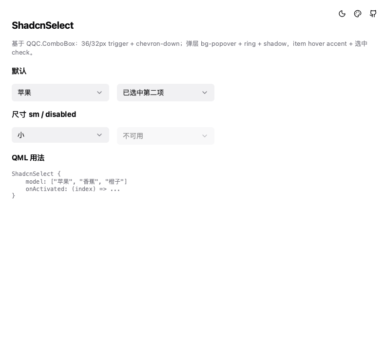
基于 QQC.ComboBox(Basic style)定制,对齐 shadcn select 规范。
用法
ShadcnSelect {
    model: [qsTr("苹果"), qsTr("香蕉"), qsTr("橙子")]
    onActivated: (index) => console.log(currentText)
}

// 小尺寸 / 禁用
ShadcnSelect { size: ShadcnSelect.Size.Sm; model: ["S", "M", "L"] }
ShadcnSelect { model: ["不可用"]; enabled: false }
属性
| 属性 | 类型 | 说明 |
|---|---|---|
model | var | 选项(字符串列表 / 对象列表 + textRole) |
size | enum | Size.Default(36px) / Size.Sm(32px) |
currentIndex | int | 当前选中(继承 QQC.ComboBox) |
视觉
- trigger:
bg-input/50+ 6px 圆角 + 左右 12px padding;右侧 chevron-down(16px mutedForeground) - 弹层:
bg-popover+ 1px 环 + shadow + fade/zoom 动画,itemhover accent+ 选中项右侧 check 图标 - 聚焦:border-ring + 3px 外环
- 键盘:上下方向键 + 回车选择
相关
- 与 shadcn Select/Combobox 对应;需要可编辑输入的下拉暂未支持