
组件
ShadcnField
表单字段容器:组合 label / 控件 / 描述 / 错误提示,管间距与 orientation。
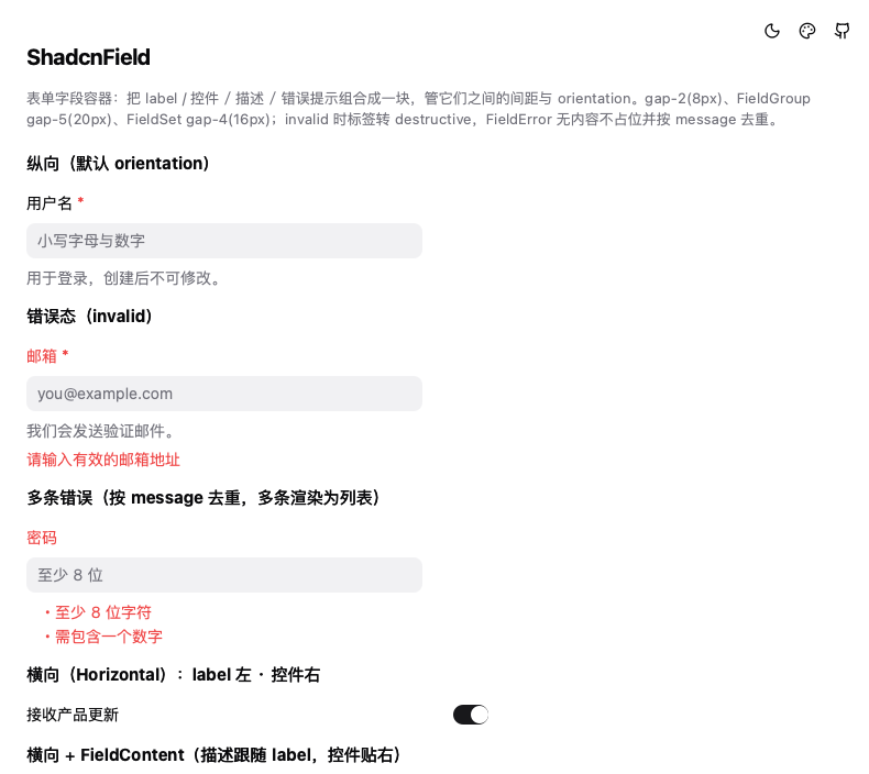
把「label + 控件 + 说明 + 错误」组合成一块的表单字段容器(shadcn field)。
Field 只管排版与间距,不含任何输入逻辑;输入控件由你自己放进去。
与 ShadcnInputGroup 的区别
| 管什么 | 层级 | |
|---|---|---|
ShadcnField | 多行之间:label / 控件 / 描述 / 错误的顺序与间距、必填标记、错误态配色 | 字段外层 |
ShadcnInputGroup | 单个输入框内部:前后缀图标或文本、padding 让位 | 字段内层 |
两者不冲突,正常用法是叠加:
ShadcnField {
    ShadcnFieldLabel { text: qsTr("搜索"); required: true }
    ShadcnInputGroup { prefixIcon: "search"; placeholderText: qsTr("关键词") }
    ShadcnFieldDescription { text: qsTr("支持正则") }
}
用法
纵向(默认)
ShadcnField {
    ShadcnFieldLabel { text: qsTr("用户名"); required: true }
    ShadcnInput { placeholderText: qsTr("小写字母与数字") }
    ShadcnFieldDescription { text: qsTr("创建后不可修改") }
}
横向(label 与控件同行)
ShadcnField {
    orientation: ShadcnField.Orientation.Horizontal
    ShadcnFieldLabel { text: qsTr("接收产品更新") }
    ShadcnSwitch { checked: true }
}
带描述时用 ShadcnFieldContent 把 label 与描述打包,描述就跟 label 同列、控件贴右:
ShadcnField {
    orientation: ShadcnField.Orientation.Horizontal
    ShadcnFieldContent {
        ShadcnFieldTitle { text: qsTr("飞行模式") }
        ShadcnFieldDescription { text: qsTr("关闭所有无线连接") }
    }
    ShadcnSwitch {}
}
错误态
ShadcnField {
    invalid: input.text.length === 0 && touched

    ShadcnFieldLabel { text: qsTr("邮箱"); required: true }
    ShadcnInput { id: input }
    ShadcnFieldError { text: qsTr("请输入有效的邮箱地址") }
}
invalid 会让 FieldLabel / FieldTitle 转成 destructive 色(等价官方
data-[invalid=true]:text-destructive)。Field 不会自己去问控件是否有效 ——
和官方一样,有效性只有业务知道,由调用方绑定。
多条错误(自动去重)
ShadcnFieldError { errors: model.errors }          // 字符串数组
ShadcnFieldError { errors: [{ message: "..." }] }  // 对象数组(react-hook-form 风格)
子组件
| 组件 | 职责 | 关键样式 |
|---|---|---|
ShadcnField | 字段容器(GridLayout),管 orientation 与间距 | gap-2(8px) |
ShadcnFieldLabel | 字段标签,required 加红色星号 | text-sm / font-medium |
ShadcnFieldTitle | 放在 FieldContent 里的标题(非可点击 label) | text-sm / font-medium |
ShadcnFieldDescription | 说明文字 | text-sm / mutedForeground |
ShadcnFieldError | 错误提示,无内容不占位 | text-sm / destructive |
ShadcnFieldContent | 横向时把 title + description 打包成一列 | gap-0.5(2px) |
ShadcnFieldGroup | 多个 Field 的纵向分组,也是 responsive 的容器查询宿主 | gap-5(20px) |
ShadcnFieldSet | 语义分组(Legend + Description + Group) | gap-4(16px) |
ShadcnFieldLegend | FieldSet 标题,Legend(16px) / Label(14px) 两变体 | font-medium |
ShadcnFieldSeparator | FieldGroup 内的分隔线,可带文字 | h-5,上下 -8px |
属性
ShadcnField
| 属性 | 类型 | 默认 | 说明 |
|---|---|---|---|
orientation | enum | Vertical | Vertical / Horizontal / Responsive |
invalid | bool | false | 错误态:整块标签转 destructive |
responsiveBreakpoint | int | 768 | Responsive 的切换阈值(px) |
ShadcnFieldLabel
| 属性 | 类型 | 默认 | 说明 |
|---|---|---|---|
text | string | "" | 标签文字 |
required | bool | false | 文字右侧追加 destructive * |
ShadcnFieldError
| 属性 | 类型 | 默认 | 说明 |
|---|---|---|---|
text | string | "" | 单条文案(优先于 errors) |
errors | var | [] | 错误数组,string[] 或 { message }[] |
messages | var(只读) | — | 去重后的最终条目 |
ShadcnFieldLegend
| 属性 | 类型 | 默认 | 说明 |
|---|---|---|---|
variant | enum | Legend | Legend(16px) / Label(14px) |
布局注意
- Field 的直接子项不要自己写
Layout.fillWidth—— 宽度由 Field 统一接管 (等价 CSS 的*:w-full/*:w-auto),写了会被覆盖 - 纵向时所有子项撑满宽度;横向时只有
FieldLabel/FieldContent拉伸, 控件保持自然尺寸并贴右(*:w-auto) - 直接子项不要用裸
x/y,位置由GridLayout接管
Responsive 说明
Qt 没有 CSS 媒体查询/容器查询。这里用「容器宽度 >= 阈值」等价实现,宽度优先取
最近的 ShadcnFieldGroup(官方断点就挂在 @container/field-group 上),不在组里
则退回 Field 自身宽度。
官方 @md 断点是 768px,但 Qt 的 Field 常被放进 320~420px 的卡片里,照搬会让
Responsive 永远走纵向、等于没做,因此阈值开放成 responsiveBreakpoint 属性,
按容器实际宽度调小即可。
与官方 registry 的差异
核实自 base-nova/field.json(2026-11-17 抓取):
required不是官方属性。官方 demo 里是手写<FieldLabel>Required Field <span className="text-destructive">*</span></FieldLabel>, 本库收敛成ShadcnFieldLabel.required开关FieldError的errors去重:官方用new Map(errors.map(e => [e.message, e]))按 message 去重,去重后 1 条输出纯文本、多条输出list-disc列表 —— 已对齐- description 与 error 不互斥:官方没有互斥逻辑,两者各占一行。
需要注意
FieldDescription自带text-muted-foreground,因此invalid时 描述文字不会变红(只有继承 Field 颜色的元素会变),这是官方行为 FieldTitle的data-slot在官方源码里也写成field-label(疑似笔误), 因此 CSS 的*:data-[slot=field-label]:flex-auto会一并命中它 —— Qt 侧同样给__fieldFlex = true,保持行为一致FieldSet的has-[>[data-slot=checkbox-group]]:gap-3分支未实现: 本库没有 checkbox-group / radio-group 的标记位,需要更紧的间距时直接设spacingcn-field-description的text-balance(横向时的平衡换行)Qt 无对应能力, 仅保留WordWrap- Choice Card 玩法(把 Field 塞进 FieldLabel 做可选中卡片)未实现:
依赖官方
has-[>[data-slot=field]]系列选择器与:has()组合,QML 无法表达
无障碍
ShadcnField→Accessible.Grouping(等价官方role="group")ShadcnFieldLabel/ShadcnFieldTitle→Accessible.name,必填时拼「(必填)」ShadcnFieldError→Accessible.AlertMessage(等价官方role="alert")ShadcnFieldLegend→Accessible.Heading
相关
- ShadcnLabel(纯文本标签,无字段语义)
- ShadcnInputGroup(输入框内部前后缀)
- ShadcnSeparator(通用分隔线)