
组件
ShadcnDialog
对话框:Base UI 规格 + sticky footer + 可滚动 body + 关闭钮。
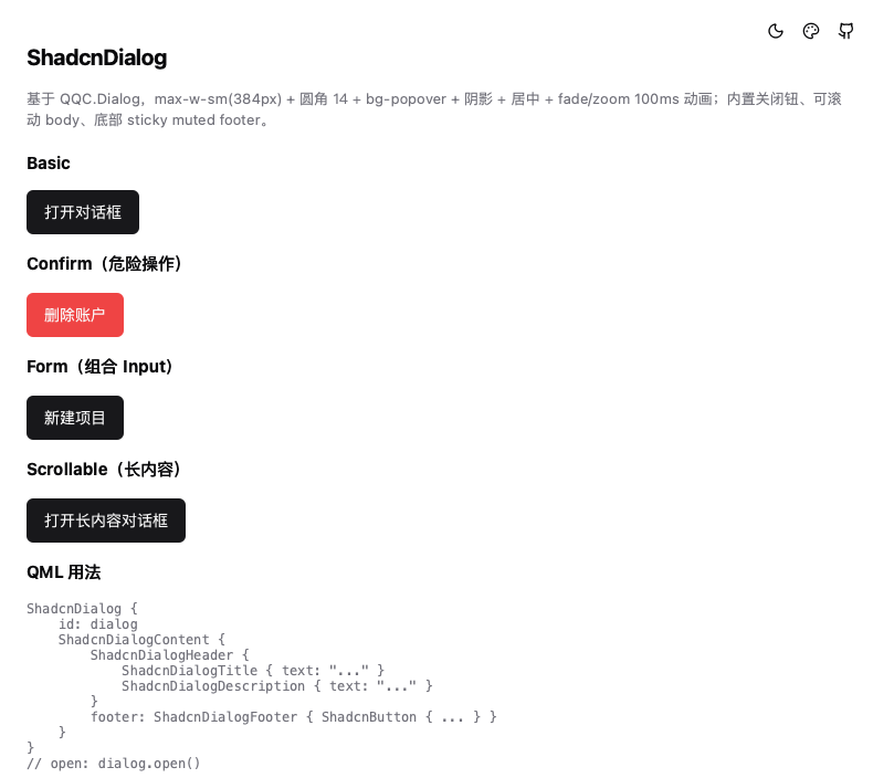
基于 QQC.Dialog(Basic style),对齐 shadcn Base UI 默认规格:384px 宽 + rounded-xl(14px) + fade/zoom 动画 + 内置 ghost 关闭钮 + 可滚动 body + sticky muted footer。
用法
ShadcnButton { text: qsTr("打开"); onClicked: dialog.open() }

ShadcnDialog {
    id: dialog
    modal: true   // 默认

    ShadcnDialogContent {
        ShadcnDialogHeader {
            ShadcnDialogTitle { text: qsTr("确认操作?") }
            ShadcnDialogDescription { text: qsTr("此操作不可撤销。") }
        }
        // 业务内容(超高时 body 内部滚动,footer 固定)
        ShadcnDialogFooter {
            ShadcnButton { text: qsTr("取消"); variant: ShadcnButton.Variant.Outline; onClicked: dialog.close() }
            ShadcnButton { text: qsTr("确认"); variant: ShadcnButton.Variant.Destructive; onClicked: dialog.close() }
        }
    }
}
子组件
| 组件 | 说明 |
|---|---|
ShadcnDialogHeader | 头部(Title + Description 垂直堆叠) |
ShadcnDialogTitle | 标题(text-base) |
ShadcnDialogDescription | 描述(mutedForeground) |
ShadcnDialogContent | 内容容器:可滚动 body + sticky muted footer 条;maxHeight 可自定义(默认 85% 窗口高) |
ShadcnDialogFooter | 底部按钮区(右对齐,gap 8) |
属性
| 属性 | 类型 | 说明 |
|---|---|---|
showCloseButton | bool | 右上角 ghost 关闭钮(默认 true) |
modal | bool | 模态遮罩(QQC 默认黑 50%) |
maxHeight | int | Content 的高度上限(超过则 body 滚动、footer 固定),默认 0.85×窗口高 |
说明
- 关闭:Esc / 点击遮罩 / 右上角 ✕
- 动画:fade + zoom-95,100ms
- 居中:相对整个窗口居中(
Overlay.overlay) - footer 为 sticky muted 条(border-t + bg-muted/50 + 仅底部圆角),长内容时固定不动